Overview
“Blueprint” is a descriptive term for the result of a reproductive process for making copies of architectural and engineering drawings. Blueprints are sometimes also identified as “diazotypes.” Positive transparencies are exposed to ultraviolet light in contact with a chemically treated paper, which is then processed. An architect’s or engineer’s drawing on transparent paper becomes a “blueprint” in which the black lines become white and the background becomes blue. “Blueprint” is something of a misnomer. Different papers produce a range of colors from an icy blue through a deep violet. There are also “sepia” papers which range in color from an orangish brown through a tan honey color. Francesca responded to and used all of these colors.
Francesca Woodman: The Blueprints
March 1 – April 28, 2012
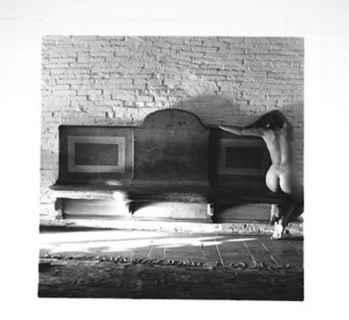
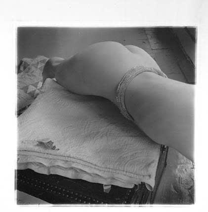
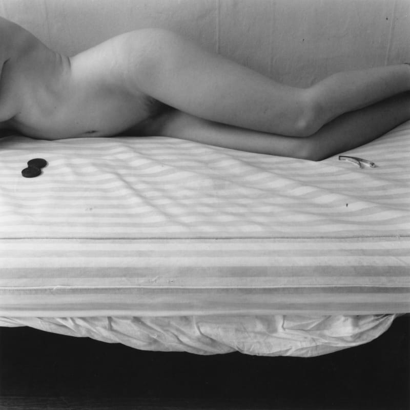
Francesca’s work is best known for small, intimist self-portraits showing a dramatized self-identity and a vivid mise-en-scène. In her last year, however, the concentration shifts to very large images—blueprints—where she no longer takes herself as the primary subject, and there is a marked interest in formal issues. Chief among these is a reliance on structural analogies. By this is meant a series of images tied together by some “logic” of similarity in forms, shapes, structures which share a common principal of organization. But first, a word on blueprints.
“Blueprint” is a descriptive term for the result of a reproductive process for making copies of architectural and engineering drawings. Blueprints are sometimes also identified as “diazotypes.” Positive transparencies are exposed to ultraviolet light in contact with a chemically treated paper, which is then processed. An architect’s or engineer’s drawing on transparent paper becomes a “blueprint” in which the black lines become white and the background becomes blue. “Blueprint” is something of a misnomer. Different papers produce a range of colors from an icy blue through a deep violet. There are also “sepia” papers which range in color from an orangish brown through a tan honey color. Francesca responded to and used all of these colors. Until the recent advent of digital drawing and printing, all houses, cars and refrigerators were built from blueprints.
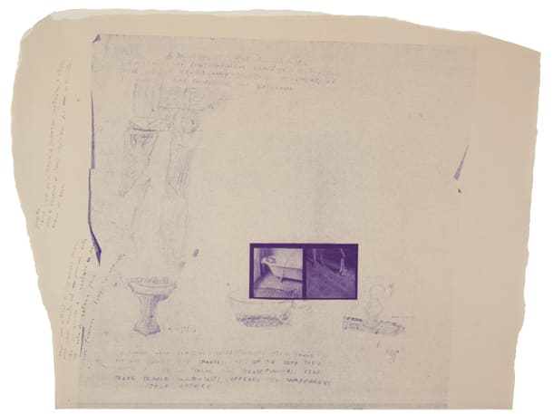
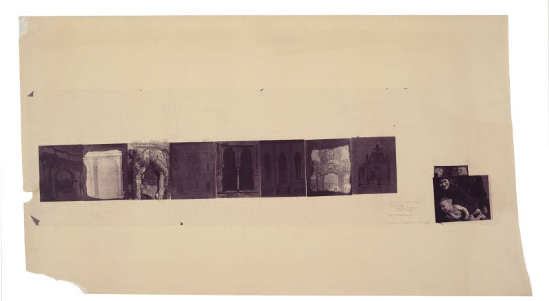
Francesca started working seriously with these processes in 1980. Two different methods were employed. In the first, she arranged 4 x 5 inch film transparencies of her images on transparent architect’s paper, combined with handwritten text and drawings. Each composition was then printed by running it through a blueprint machine, as if it were a normal architectural drawing. These intimate prints ranged from about 7 x 15 inches to longer, quasi “narrative” pieces about 12 x 60 inches and larger.
The second process was more radical. A large piece of blueprint paper was fastened to the wall of a darkened room. This paper comes in long rolls, about 3 feet wide. A black and white transparency was projected onto the paper with a slide projector, usually for several hours. The paper was then“processed” by running it through the process part of a commercial blueprint machine. The friendly assistance of the elderly proprietor of a blueprint shop was an indispensable adjunct to her life as an artist.
To understand what was happening, one must imagine Francesca working alone in New York, enjoying the large studio of her father in a neighborhood with several blueprint establishments. Both of her parents were in Italy for the summer. Francesca made 36 x 80 inch sepia-colored blueprints of the legs of the family’s dining room table, then to be transported to the woods of New Hampshire and in turn placed among the trees as “installation” art, and eventually photographed there. On a smaller print documenting the project, she remarks: “It’s very hot and I am sitting on the floor by the window. Looking through the table legs + chair legs I try to think about trees, about the woods. I want to return the wooden table legs to the woods from whence they came.” Francesca had a residency at the McDowell Colony in Peterborough, New Hampshire in the summer of 1980, which set the scene for this project.
While at MacDowell, she was also photographing her own arms among the thin birches in the woods. There was a continuous tissue of experience from the prosaic commercial blueprint process of New York, to table legs and trees, then to Daphne and Apollo in the woods of New Hampshire, and the resonance of Ovid’s poem about these two in the woods of Italy—also familiar to Francesca.
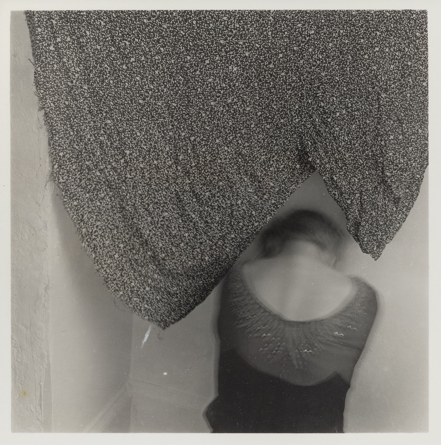
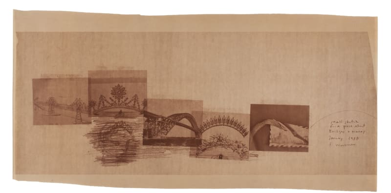
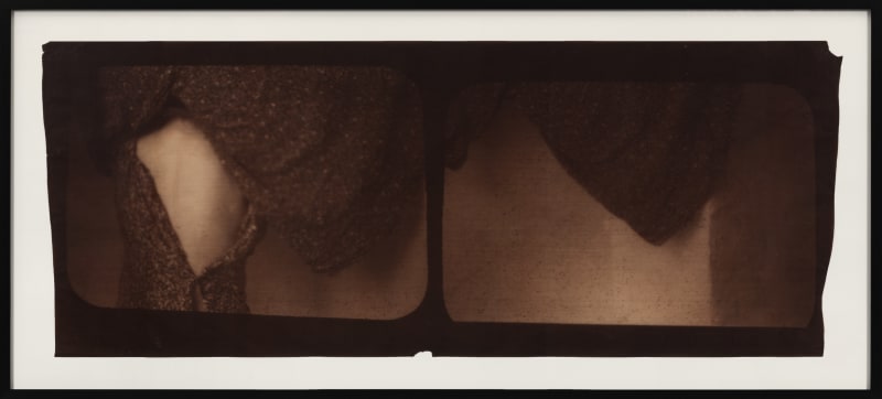
Many of Francesca’s blueprints are dominated by a formal motif, a shape repeated to create a zig-zag. Modernist abstract art devotes itself to the form of the square, the rectangle, the box, the intersection of streets, the whole right angle world of horizontal and vertical. Domination by a zig-zag motif is very rare, but it occurs throughout her blueprints. It creates a world of flux without horizon, a rhythmic oscillation. Francesca made studies of zig-zags: from representations of houses, noses, hands and baby’s legs. A related investigation was the series Bridges and Tiaras. In these prints, the bridge, arching over the river, and the tiara, arching over the woman’s head, are contrasted and linked by the logic of analogy. Francesca creates visual puns, jokes and poetry in this series. The zig-zag reached an apotheosis in the enormous composition of a draped dress and a girl’s bare back. The print has a stillness, a repose, in its world of sepia glow, which is remarkable. The dress, its moment of cloaking, is in arrest. The girl is present in a shape formed by the dress. She, in her absence, is echoed in a triangular shape in the adjoining image. The image of a stilled action, a motionless repose, echoes an auditory response. This is a great image of silence and secrecy.
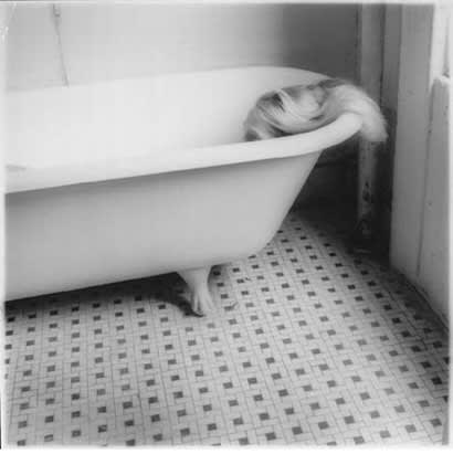
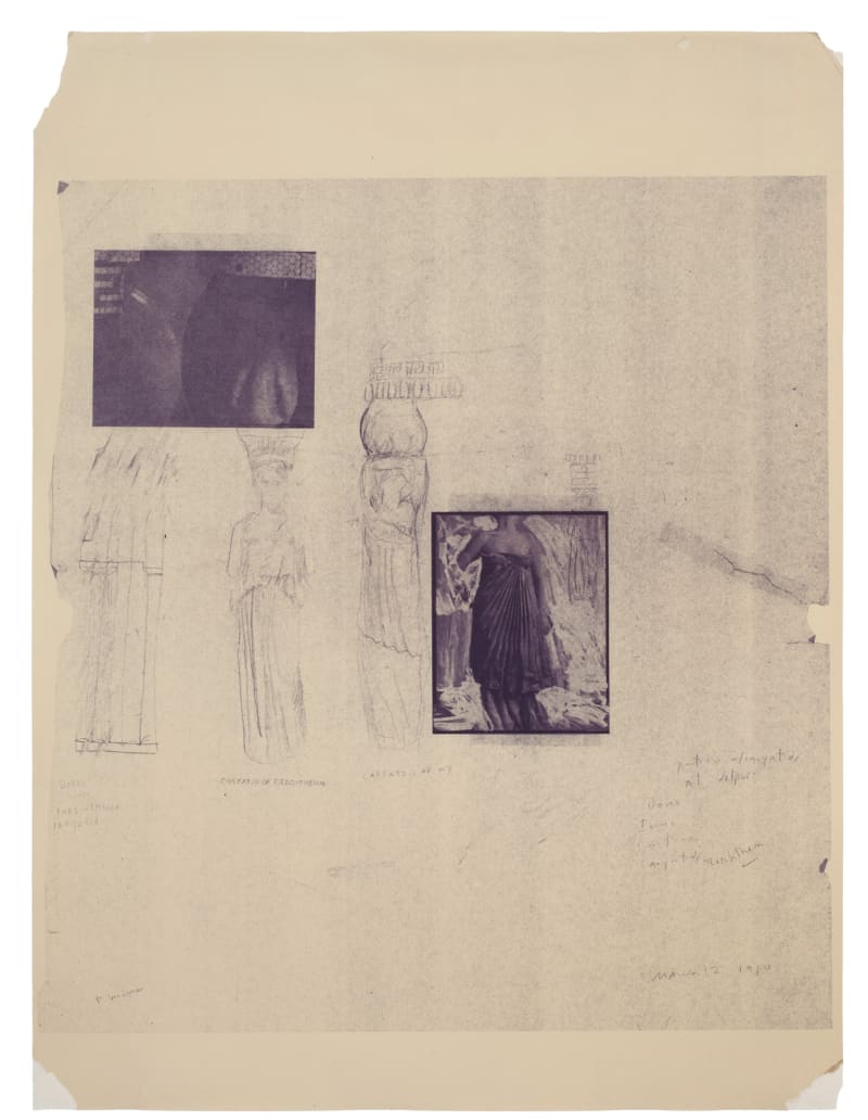
Francesca’s major work in the blueprint medium is the large Blueprint for a Temple, currently on view at the Metropolitan Museum of Art in New York in the exhibition Spies in the House of Art: Photography, Film, and Video. This grand fifteen by ten foot collage of blueprints brings together details from New York bathrooms of a century ago— decorative tiles, details of fixtures, that echo classical motifs—with grand female figures—caryatids. The bathroom details were closely observed at friends’ apartments. The exalted caryatids were her friends posed in New York. But she had experienced at first hand the sublime caryatids of the Erectheum on the Acropolis in Athens when she was about sixteen years old.
There are small blueprints which play with the juxtaposition of the varied classicisms that entered the Temple. These small blueprints, seemingly preparatory studies, bring disparate elements together in a light-handed poetry. On one she notes that “Bathrooms with Classical inspiration are often found in the most squalid and chaotic parts of the city. They offer a note of calm and peacefulness like their temple counterparts offered to wayfarers in Ancient Greece.” In some respects, these small prints relating to the Temple, alongside other small prints, represent an artistic autobiography of the last year of her life. In Francesca’s monumental caryatid figures, there is great poetry in these still, remote, beautiful figures existing in a twilight of blue violet. She perhaps had the classical caryatids of Erectheum as an inspiration in her mind but they now seem to exist more in the realm of the “Angels” of Rilke’s Duino Elegies.
Who, if I cried out, would hear me among the angels’
heirarchies? and even if one of them pressed me
suddenly against his heart: I would be consumed
in that overwhelming existence. For beauty is nothing
but the beginning of terror, which we still are just able to endure,
and we are so awed because it serenely disdains
to annihilate us. Every angel is terrifying.
Equally mysterious and remote is the great face of her blueprint Head on a Rug. The grand symmetry and frontality of this image remind us of a byzantine mosaic of the Pantocrator, like that in the cathedral at Monreale, Sicily. The impact of the scale of this face is softened by its presentation in a field of flowers, created by the floral pattern of the rug. Francesca’s smallest black and white photographs nearly always contain some little gesture which places the picture in a moment of time. The same thing occurs here when she placed a single real flower on the carpet’s pattern of flowers and, near it, a couple of fingers which signify touch and the intimacy of touch, bringing us to her.
George Woodman with Katarina Jerinic New York, February 2012
